

Welcome to the forty-sixth installment of Queer Your Tech with Fun, Autostraddle’s nerdy new tech column. Not everything we cover will be queer per se, but it will be about customizing this awesome technology you’ve got. Having it our way, expressing our appy selves just like we do with our identities. Here we can talk about anything from app recommendations to choosing a wireless printer to web sites you have to favorite to any other fun shit we can do with technology.
Header by Rory Midhani
Well, my iPhone/iPad-owning queermos, it’s that time again. It’s time to update your software. Apple released iOS 7 on September 18th and, supposing you got through the 12 hour download and install, it’s time to finally figure out how your iOS device changed. To be clear, this guide isn’t for people planning to order the iPhone 5s or 5c, so we’re not really gonna talk about that finger print scanner today. Naw, this guide is for those of us with pre-existing iDevices that underwent a crazy overhaul this week.

My over-all first impression: iOS 7 is sexy. The new flat look – clean and futuristic. The addition of layers makes the interface feel less cluttered. And they did away with a lot of cutesy stuff that just made everything feel messy.
Important! Back Up Your Device First
If you haven’t upgraded yet, this is your PSA. Before doing any software updates or upgrades, it’s really important to back up your iPad or iPhone. This guide is still pretty applicable if you’re not sure how to do so. Updates/upgrades don’t usually go poorly, but when they do the results can be devastating to your data.
Okay, did you do that? For real? Okay, read on.
Multitasking Got Easier
To get to your multi-tasking view, you still tap the home screen button (the circular button on the face of the device) twice. But things will look a little different once you get there.
You no longer have to press and hold to close apps. See those thumbnail pictures of what’s going on in the app? Just place one finger on the thumbnail and quickly swipe up to the top of your screen. Bam. App closed. So much easier. Less button pushing. Better flow.
Spotlight Moved
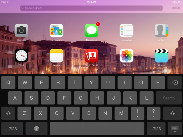
I always thought that weird spotlight screen was like an appendix. They’ve taken it away and made it much more visually appealing – you can now spotlight search your iOS device by using one finger and quickly swiping down – and you can do this from anywhere on the screen. Except the very top. Pulling down from the very top of your screen will get you Notification Center, which now has a handy “Today” view.
Control Center is My New Favorite Thing
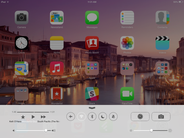
You can get Control Center by swiping up from the bottom of the screen, even when in lock mode. And it is everything I have ever wanted shortcuts for. Let me tell you why. I frequently travel and I frequently use my iPad to write while I’m traveling, which means I am in possession of a bluetooth keyboard. If I do not turn off the bluetooth connection, however, the keyboard gets banged in my bag. This has resulted in my iTunes library beginning to play at embarrassing moments. It used to be a bit of a pain in the butt to go turn the bluetooth off – it was in settings. And now! Now I can just swipe up and hit that bluetooth button. I can do the same thing with airplane mode! And Do Not Disturb! And the timer (which is good, because I use the timer for baking and to remind me when to take the moisturizing mask off my face). You can also find the Camera, Brightness, and all iTunes controls in here as well. Oh, and on the phone, there’s a flashlight here. And a calculator shortcut.
I Can Now Actually Use iCal
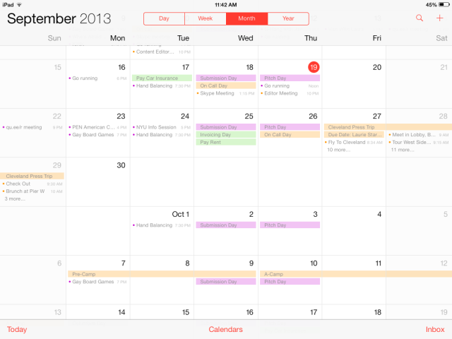
I recently started outsourcing all my mobile calendar needs to an app called Cal. When I upgraded to iOS 7, I deleted Cal. Why? Because iCal now both visually appealing and usable. The brown stitching across the top used to drive me crazy – so cluttered! But now the app is streamlined and gorgeous. Much of the functionality is still the same – tap and drag to create events, for instance. But there’s one huge thing for me: the continuous scroll in month view. I did not know I needed this until right this very second. See? You can stop between the end of September and the beginning of October and see both months at once.
Safari – It’s Different!
When you launch Safari, all your book marks are right out in front in this lovely grid shape, which is once again super clean and uncluttered. And instead of private browsing being all tucked away, it’s right there – just take a look in your lower left corner. Search all the porn you like! This might also be a good time to discuss the new share button – it’s still a box with an arrow coming out of it, but it’s a got a much different look to it. You can see it in the top right corner of Safari, next to the back and forward buttons.
The Camera Got Some New Features
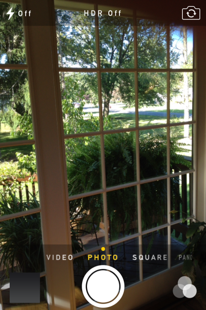
The camera is lookin’ sharp with its new almost entirely text-based look – scroll through your options just above the shutter button. You can now also take square pictures – is this a thing people wanted for Instagram? And hey, speaking of Instagram, there are now filters you can choose right from the camera. Panorama is easier to get to (it’s in that click wheel of options), but the functionality is the same.
Photos – They Self-Organize!
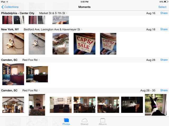
Instead of being one big mass, the photos now sort themselves into “moments” based on time and place. You can even share entire moments by tapping the share text to the right of the moment. It’s so much easier to find things – and if you go all the way out to years level, it’s kind of a “this is your life” thing. Also, the photos still show up on a map if you tap the headings above the moments/collections/years. Check out A-Camp on my map!

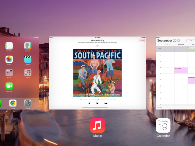
iTunes Radio. Now a Thing That Exists.

I’m using iTunes Radio on my iPad Right now. And I am not ashamed to admit that I immediately used it to create a Broadway channel via the [title of show] soundtrack. So what is iTunes Radio? It’s like Pandora – create or choose a station and iTunes will stream music that fits into that category. So for instance, I selected [title of show] and it played a song from that show (“Way Back To Then,” if you’re curious). Then “One” from A Chorus Line. And then “Morning Person” from Shrek The Musical. In the top corner, there’s a purchase button in case you hear something you absolutely can’t live without. And using the info button (the “i” in the little circle above the album art) you can do things like create a new station based on the current song or artist, or allow explicit tracks to play.
Game Center Isn’t Fugly Anymore!
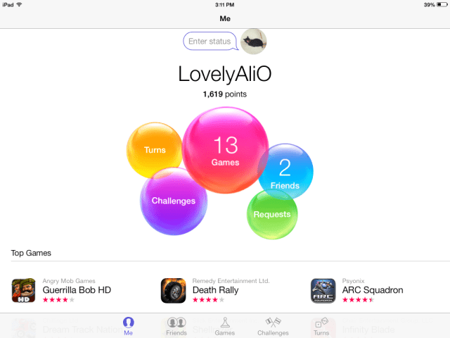
It used to be a felt monstrosity reminiscent of a pool table. Now it’s a well designed cluster of happy bubbles. I might tap on game center more now that it’s not terrible. But as you can see from the above picture (I have two whole friends!), I don’t really use Game Center and don’t know as much about it as I do about the other features. Kotaku explains it pretty well in their rundown of iOS7 features, though.
Folders Are A Bit More Expandable
Folders are not just prettier. I tested them out and they house more than they did before. Folders are more like their own miniature home screen and are no longer limited by how large the display is – instead, they just scroll over like any other home screen. Oh, and you can put Newsstand in a folder.
I Personally Think The Unlock Screen Is Easier to Use
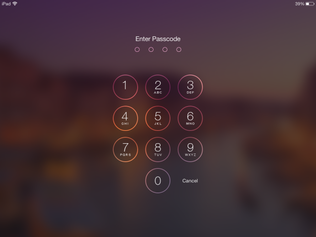
Like everything else, the lock screen and passcode input are prettier. But I also truly believe it’s easier – with the numbers definitively in their own space, I seem to eff up with my ham fingers a lot less. They’ve kept the slide to unlock feature, but it seems to make a whole lot more visual sense now what with the whole screen sliding to reveal the passcode puncher.
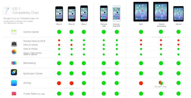
Some of You Got Airdrop. I Didn’t.
Womp womp. I have an iPad 2 and an iPhone 4S. Wireless drag and drop file sharing is a thing I have on my computer and love, but it is juuuussssttt out of reach for me on my mobile devices (the iPhone 5 has it). In fact, not every feature in iOS 7 works on every device. Check out this handy chart from The Apple Lounge:
…And For the Font Junkie
The new font is called Helvetica Neue Ultra Light. Just FYI. Because I see y’all. I know some of y’all were wondering.
In short, iOS 7 has been a major win for me. The only thing driving me crazy is that when I turn the pages in my Feedly app, I accidentally bring up the control center, which then sends me to different sections of Feedly. But that’s literally the only thing I don’t like. How about y’all? Please feel free to leave your iOS 7 tips, tricks and feels in the comments below. Have an Appy Weekend.


Comments
I was waiting for this article before I did it! But I couldn’t wait any longer and updated last night. I wasn’t sure how I would feel about it, but I actually like the new look.
I’m SO INTO the new look. It’s so pretty.
I traded in my iPhone 4s for a new Silver 5s.
Absolutely love the new phone and iOS. Sleek, sexy and incredibly fast and the new interface is great as well.
What’s up, fellow font junkies?
I see you, fellow font fan. I see you.
I am making some seriously envious noises right now. Mission Unlocked: Save Up For iDevice, Lose Android Thing.
I like that you can disable the control center in app if it gets to be too bothersome. And redesigned safari. Cool article!
I’m loving iOS7 so far! It feels like having a whole new phone. So much prettier and nicer to use!
Guys, iOS 7 is so much smarter! I taught Siri how to pronounce my name! We had a cute little bonding moment, we’re friends now. Actually, now you can teach Siri how to say any and everything, just tell her “That’s not how you pronounce that” and, bam, Siri learns from YOU.
Also, it’s got a new ringtones and a nifty new custom vibrations feature. Totally brought me back to 8ish years ago when I considered my phone purely on its ringtone capability and spent hours deciding which one would go to which friend. If you don’t like the control center popping up when you’re playing games or whatever, you can choose to disable it in your settings.
Only problem that I have right now is the music player doing things I don’t want it to (like occasionally not playing music). Haven’t figured out how to fix that yet. (Anyone else have this problem?)
Admittedly, I just spent most of last night getting to know iOS 7. ‘Twas definitely an upgrade…and a necessary one. I’m an Apple products kind of girl and it was getting pretty annoying looking at android products with a twinge of envy. Hooray for improvements!
Dude, I haven’t tried the Siri thing yet because I don’t really use it. But you know, now I’m going to have to try all this fun stuff.
Me too! Can I teach Siri a new language?
Ugh. I didn’t realize that when I gave myself a fake name on Facebook, that Siri would use that information. I was so proud of myself for teaching her to pronounce my name right on iOS6, and now it’s all for nothing.
Every time I look at iOS7 it makes me want to go get ice cream or have a lolipop. It feels like candy land on your phone!
I’m not a tech nerd, but even I can appreciate iOS 7, and that makes me feel like a sexy tech nerd.
Hm. I’m still not bought over… I think it will be a little while before I upgrade (or until my apps require iOS 7 only updates).
I like the old app button details and was a huge fan if the calandar pages turning. In time I’ll get there. I feel iOS 7 and a new laptop with windows 8 in the same week was a little unfair (but it was a free laptop so I can’t complain too much)!
i feel like such a grandpa because i have an 3gs and i’m pretty sure it’s not even capable of upgrading to ios 7.
Yeah, I have a 3gs too and it doesn’t update :<
you have no idea how long it took me to figure out how to close applications on the iPad after the update omg. thanks to this post i might actually use some of the new features instead of avoiding them out of confusion! thank you ali
Me too! Another small thing that was aggravating me: it took me forever to figure out that to delete things now (e.g. message threads, cities in the weather/clock apps) you swipe left instead of right.
The prominence of Broadway musicals in this post fills me with joy!
You have no idea exactly how much I love Broadway musicals, how many soundtracks I actually own, and how many of these songs I know back-to-front. Spoiler: an embarrassing amount of all of those.
*whispers* cast recordings. :p /geek
Ewwwwwwww I HATE my IOS7. I am so sad I updated it. I HATE the new look and the flat icons. It went from looking futeristic to looking like 90’s first generation keyboard etc. Now, even if I put the flash to ‘on’ and try to takes selfie or a picture of my gf sleeping in the dark, it will take the photo like 7 times and only flash one time. Also, the swiping instead of tapping to close apps takes WAY longer. I wish they had done all of the updates without ruining the traditional iPhone look.
iPhone….you no droid. Stop trying to look like one.
I agree re: swiping instead of tapping to close apps, the new multi-tasking interface is probably my least favourite thing about the update. I don’t think it flows better now that it takes longer for me to see what I have open (instead of previously seeing 4 icons at a go, and only visibly changing part of the screen so it’s less confusing). But to each their own!
I’m stubborn and resistant to change so I’m going to keep iOS 6 until I’m the last human on Earth with it and then reluctantly change because I’m jealous that everyone else’s phones look different than mine.
I still have iOS 5….
The new look is DOWNRIGHT SEXY. I just unlock my phone all the time to look at it. I like the new wallpapers too. I usually never use the wallpapers but they’re prettttyyyyyy. The new text sounds are nice too and btw I’m rockin “synth” for texts right now…I feel so new wave.
I just feel the need to point out:
“Search all the porn you like! This might also be a good time to discuss the new share button”
FLAT!!! STYLE!!
THANK YOU APPLE.
no more fake 3D buttons with shine gradients. no more drop shadow on everything. no more fake leather stitching on the calendar app. GLORY BE.
Is anyone else having problems with Instagram on iOS7? I’ve got an iPhone 4 and Instagram looks terrible, it doesn’t fit the screen properly when you’re editing a photo…
It’s optimized for the taller screen of iPhone 5*. Guess they decided not to bother coding it to fit any other screens.
i only updated to ios6 about 3 months ago after all my apps had stopped working one by one, and i hated it. but 7 seems alright so far.
ali, your guide has helped me adjust to the change a little easier, ithankyou :)
Wow I’m the only one who absolutely hates ios7, especially on my iphone. It sucks hardcore.
The new look for texts freaks me out. Too.. big and bouncy or something. I do like that you can swipe to the left and see all the timestamps. I had to specifically look that one up because I got angry when I wasn’t seeing any timestamps at all during an hour long consistent coversation (whereas iO6 would show you the time every 15 minutes or so)
The bouncing thing is disorienting me too. Why?! I do not understand. I’m personally okay with the new look of texts, but white on blue/green is not doing wonders for its readability.
Is closing apps a thing I should be doing? I tend to just press the home button and forget about it, and since I never turn my phone off I’m probably unintentionally running about 50 apps at once. Can you close and app while you’re using it or only after you exit? I don’t understanddd
I’m kind of indifferent about iOS7 at the moment but I’m sure I will come to love it… I definitely appreciate the control pad, since I tend to keep the brightness low on the whole but every now and then I find myself in the bright light of the great outdoors and have to flail around for 5 minutes trying to navigate through the lock screen and settings to make my virtual world visible again
Some apps continue running (and thus draining battery) when you leave them open, so you should probably just close whatever you’re not using!
I have an android (because I have T-mobile and I can’t get 4g on an iphone through T-mobile yet!) but now that they did this update, I am thinking of just sticking with an android… the iOS7 update looks very similar to my friends Galaxy S4. And the iphone doesn’t have Swype.
I feel like there is a new trend in technology of seamless integration with your life, and I feel like this upgrade did a lot to make the iphone feel like less of an intrusive device. The new sounds and tones are very pleasant, the interface is lightweight and smooth, and all of the transitions are much smoother and more seamless. Loving the update!!
My relationship with it is still pretty love/hate. ICal is sooo much nicer now than it was before, but I have to admit, I hate the red on white. It’s probably sad how much it actually bothers me. And I don’t care for the new white on blue message display either. Guess I’m just big on colors haha. I do love the new lock screen though, and being able to tuck away newstand. And Safari is so much sexier. And with the update I actually get service in my house, which before the update I barely even had a bar. Now I can get up to 3!
Thanks so much for this Ali!! I was skeptical and kinda worried about updating to iOS 7. I didn’t want to update and not know how to use my phone anymore. Thanks to this article I was able to update in confidence. I’m kinda falling in love with my phone all over again. It’s like brand new!!!