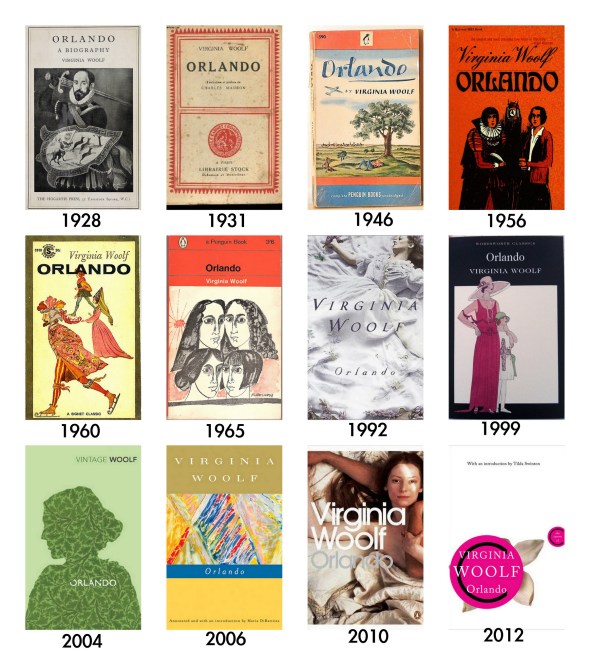
1. Orlando, by Virginia Woolf (1928)
There are approximately ten bajillion English-language editions of Orlando from a number of different publishers, and most aren’t straight-up reprints. It seems each publisher took their own approach to conveying the book’s subject matter — generally by not conveying anything at all.
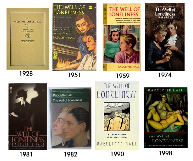
2. The Well Of Loneliness, by Radclyffe Hall (1928)
This is one of the most depressing and the most controversial books of all time, which means it had to suffer through an obscenity trial and other legal actions, including customs seizures, in the U.S. and Britain, before it could be sold openly. The 1951 cover, which features women dressed like it’s the ’50s even though the book took place decades earlier, describes its contents as “the strange love story of a girl who stood midway between the sexes.” The 1974 edition tried a little harder to be true to the time period, but the ladies are in heavy makeup wearing historically inaccurate costumes. After a 1981 foray into the wilds of terrible/AWESOME, it seems in the ’90s they abandoned attempting to picture actual lesbians on the cover and began using fine art instead. Personally I feel a more accurate cover would be a picture of me stabbing my eyes out with DON’T READ THIS BOOK in large block letters over my face.
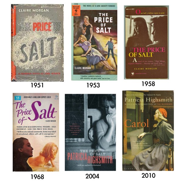
3. The Price Of Salt, by Patricia Highsmith (1951)
Patricia Highsmith, best known to the masses as the author of the book that became The Talented Mr. Ripley, published her lesbian novels under the name “Claire Morgan.” As time passed and it became okay to be gay, Highsmith’s novels were printed using her real name. International editions and the most recent English-language version I could find use a different title, “Carol,” the love interest of the book’s protagonist (Therese).
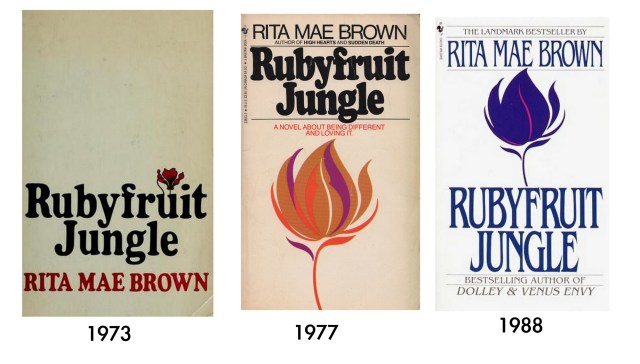
4. Rubyfruit Jungle, by Rita Mae Brown (1973)
Tiny feminist press Daughters Publishing Company produced the first edition of this novel, which caught the eye of Bantam Books, who reprinted Rubyfruit Jungle in 1977, where it became the first mainstream U.S. besteller with lesbian themes. Honestly, I still like the 1973 cover the best.
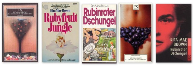
The American versions throughout history are coy about the subject matter, to say the least. Overseas, things were a little more direct.
5. The Color Purple, by Alice Walker (1982)
Then 1985 cover comes from the film, and the 2006 cover from the Broadway musical. AS per ushe, I like the first one the best.
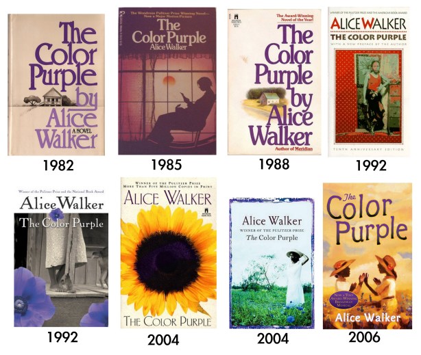
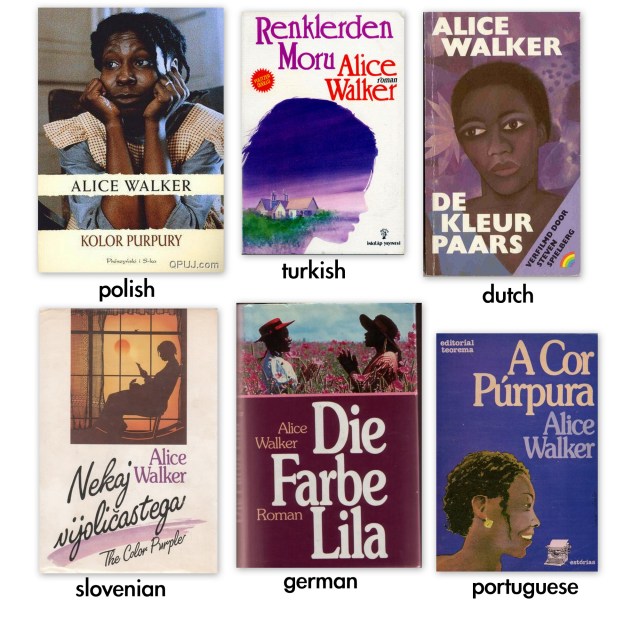
It seems like in the international editions, publishers were more eager to put heads, rather than flowers, on the cover:
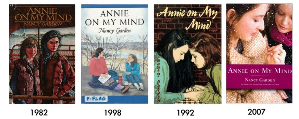
6. Annie on My Mind, by Nancy Garden (1982)
Nancy Garden hated the first cover designed for Annie on My Mind, which pictured Liza and Annie on the Esplanade in Brooklyn, with Liza standing away from Annie. Garden said, “it really looks as if Annie is going to swoop down on Liza — almost like a vampire attacking.” She didn’t like the next cover design either, because she wanted to see “the two girls really relating to each other equally.” Finally she got what she wanted, ten years later.
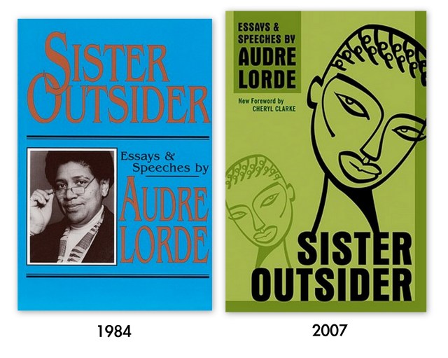
7. Sister Outsider, by Audre Lorde (1984)
The Crossing Press in California, founded in 1963, published Sister Outsider back in 1984 and featured a photograph of Lorde, taken by Salimah Ali. Crossing Press was purchased by Ten-Speed Press, a Berkeley-based press founded in 1971, in 2002, which was subsequently purchased by Crown Publishing, a division of Random House.
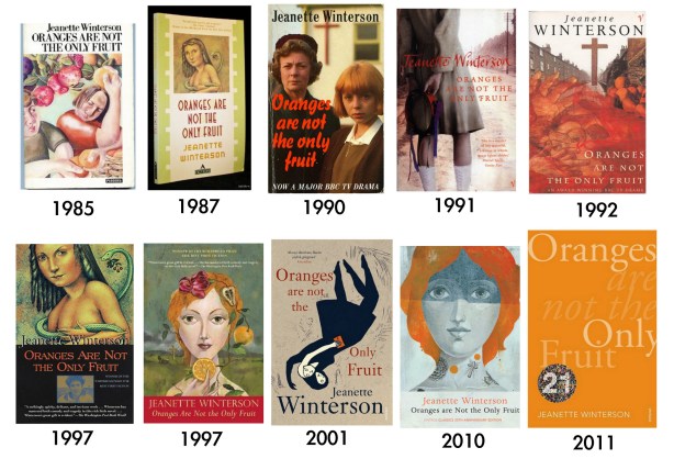
8. Oranges Are Not The Only Fruit, by Jeanette Winterson (1985)
Anita Kuntz illustrated the picture on the cover of the 1987 edition, and Olaf Hajek illustrated the second 1997 cover illustrated below. Hajek also designed the covers for relaunches of Winterson’s Sexing the Cherry and The Passion. The 2011 cover is part of Vintage 21, 21 books released by Vintage to celebrate their 21st birthday and if you buy all 21, you will have a beautiful rainbow on your bookshelf.
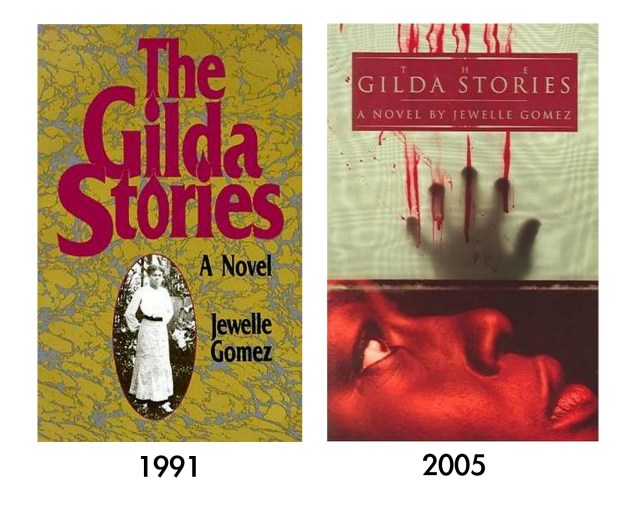
9. The Gilda Stories, by Jewelle Gomez (1991)
The woman pictured on the original cover is Gomez’s great-aunt Effie. Although Gomez never met Effie, she recalls that her great-grandmother heard Effie’s voice calling to her after she died, a story which Gomez says “shaped my writing forever.” The new edition hints more strongly at the book’s content: VAMPIRES!
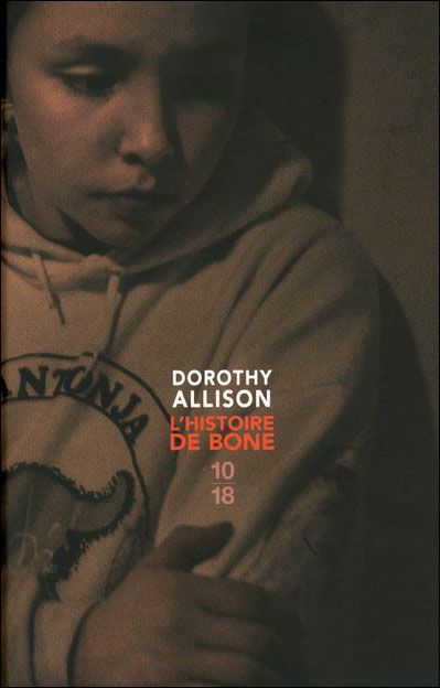
10. Bastard Out of Carolina, by Dorothy Allison (1992)
The 1993 Flamingo imprint is super-weird, it looks like a book about a teenage pyromaniac. I’d like to conference with whomever signed off on that one. The 2012 20th Anniversary Collection cover, though, is pretty awesome, and the cover art is the work of queer lady Jessica Sabogal, “a first generation Colombian American graffiti artist, hip-hop dancer, toymaker, and photographer.”

I also really like the French cover:
11. Stone Butch Blues, by Leslie Feinberg (1993)
It’s really interesting that they chose to go from a younger picture of the author to an older one with the new edition, even though the narrator, I presume, remains the same age. It really serves to bring the author’s whole life to bear upon the book.

My favorite take on it is actually the Chinese cover from 2006:

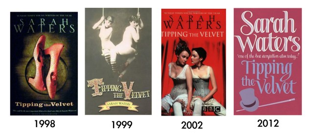
12. Tipping the Velvet, by Sarah Waters (1998)
My edition of Tipping the Velvet looks a lot like the original American imprint, published in 1999, and described in The New York Times as “a mildly troubling picture, one that immediately arouses curiosity. You want to know more about the occasion; you scold yourself for being titillated; you find yourself noticing that the photographer has distanced the girls from the audience: the charms they so frankly display are out of reach and will remain so.”
The cover using the BBC adaptation’s actors might actually be the best representation of the novel’s content, though I always find it impossible to separate any face I’m shown on the cover from the character described within. The 2012 Mass Market paperback edition of Tipping the Velvet is a curious choice; foregoing humans and shoes in favor of a top hat and cane.
Please note: It’s possible that some of these dates are wrong! I found a lot of book covers that looked really contemporary but were cited everywhere as being from the ’70s or ’80s, and so I left those out, but I assume based on that experience that there are other inaccuracies as well, but I did my very best to verify the dates.