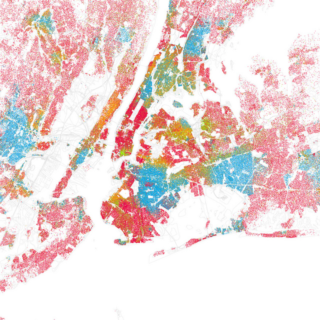
How segregated is your city? Check out these maps made byEric Fisher. Based on data from the 2000 census, these maps of 40 U.S. cities use dots to represent people to try to minimize generalizations [although he does collapse the census’s [somewhat dubious to begin with] categories into 5 broader ones.]
Find your city; you might be shocked at how easy it is to locate streets, universities, and other landmarks based on race alone. Here’s New York.


Comments
Thanks for the link, interesting stuff. I’m def a very visual person, so I like seeing stuff mapped out like this. I’d love to see my hometown and some other Canadian cities mapped the same way.
On an unrelated note…the new site redesign looks good!
Wow these maps are wierdly shocking. Like it’s not like I was under the impression that racism doesn’t exist anymore but I didn’t expect this level of segregation. Amazing idea.
born and bred DC gal here, and yeah, its crazy how segregated cities can be by race and wealth. DC in particular is an extreme city that way. For such a small city its really two cities in one.
Chicago is definitely the most segregated city I have been in aside from D.C. Chicago class plays a part in the segregation, but not entirely. Even the suburbs are extremely segregated! I’ve seen this map before in a few classes I’ve taken. It is unsurprisingly accurate.
NYC looks like a hand petting a snarling dog.
well this suck but is believable. Indianapolis is just this big red blob with a dark blue circle in the upper middle.I live in the Avon part. There was a total of 23 “blue” people (im the 23rd)in my graduating class of over 600 hundred people.I didnt even see the other colors. They werent even on there.
It would be really interesting to see a map like this of Sydney. Of course, they’d have to change their categories pretty drastically. (I think Asian would have to be split into East Asian and South Asian, for example.)
Also, I am not at all surprised that Seattle is so white.
I just spent an hour looking at these maps. It’s fascinating, I can’t stop.
My city (Omaha) in particular was interesting because there is visible evidence of “white flight” our downtown is surrounded to the north by a large black population and to the south a large hispanic population, and the river prevents the city from growing east, so you can see all these little red dots just spreading way out to the west. I mean, I already knew this, but it’s kind of amazing to see the visual evidence.
Like I needed this map to tell me how white Salt Lake City is, hahaha. With the spots of color right where they are expected
The Census Bureau did something similar, but has several other maps as well showing distributions of education and income levels, among other things.
http://projects.nytimes.com/census/2010/explorer?hp%3Fhp